


Wayfinding design plays a critical role in how people move around buildings and public spaces. Poorly planned systems lead to confusion, delays, and a negative experience for visitors. Despite investing in signage or layouts, many facilities still face complaints about difficult navigation.
At SPM Design environmental wayfinding design, we often identify the same set of errors that reduce the effectiveness of otherwise well-designed spaces. This article outlines the most common wayfinding design mistakes—and the practical steps you can take to prevent them.
-
Overloading People with Information
Excessive info can be just as bad as less information. If a sign is cluttered with long text or too many directions, people won’t read it. They’ll ignore it or feel overwhelmed.
How to fix it
Keep your messages concise and to the point. Use clear icons. Break long paths into steps with simple signs at key points.
-
Inconsistent Design Elements
One of the most common mistakes is inconsistency. When fonts, colors, or arrows change from one area to another, it confuses users. It feels like the system isn’t connected.
How to fix it
Ensure that all of your signs have a uniform design. Use the same fonts, arrow styles, and color codes throughout the entire space.
-
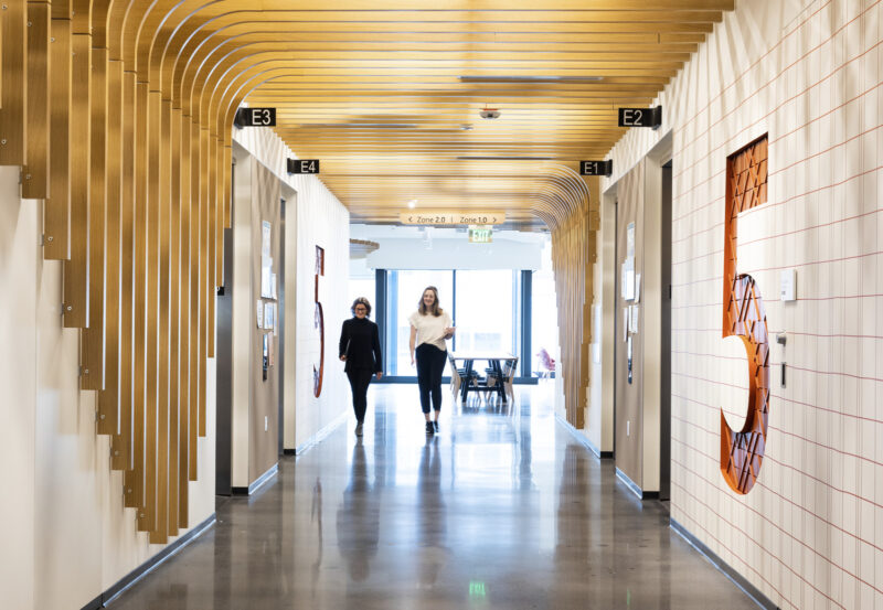
Poor Placement of Signs
You’ve probably seen signs hidden behind doors, blocked by plants, or placed too high to read. If signs aren’t in the right place, they lose their purpose.
How to fix it
Consider the perspective of a first-time visitor. Walk through the space and note where you’d naturally look for guidance. Place signs at eye level, near decision points, and before someone needs to make a turn.
-
Ignoring Accessibility
Not everyone sees or moves the same way. If a sign isn’t readable for someone with low vision or isn’t reachable for someone in a wheelchair, it fails a big part of the audience.
How to fix it
Follow ADA guidelines. Use large fonts, high contrast, and Braille where needed. Ensure signs are easy to access for all users.
-
Lack of Testing with Real Users
Many designs may appear visually appealing on paper but often fail to deliver the same impact in reality. One of the biggest mistakes is not testing the system before it’s finalized.
How to fix it
Walk the space with people who’ve never been there before. Ask them to find common locations using only your signs. You will quickly recognize what is effective and what is not.
-
Design That Ignores the Building’s Flow
Every space has a natural rhythm. Some hallways are busy, some are quiet. If wayfinding doesn’t match how people actually move, it won’t help much.
How to fix it
Observe how people use the space before placing signs. Follow foot traffic patterns. Adjust the sign locations and types based on real behavior, not just floor plans.
Final Thoughts
Good wayfinding isn’t just about signs. It’s about thinking through how people feel when they move through a space. It’s about clarity, simplicity, and making the journey stress-free.
With SPM Design environmental wayfinding design, you get more than just graphics—you get thoughtful systems built to guide people with ease. Avoiding these common mistakes can make all the difference in how a space is experienced.